12/7/09

WHAT GOES AROUND COMES AROUND

"Room of the Month" July 1978 Pacific Design Center

OK here's the background, the year was 1978 I was a couple years out of high school and I was asked to design the "room of the month" in the lobby of the then new Pacific design center in Los Angeles. This task was usually asked of seasoned professionals, I guess they wanted to see what the new kid would do?

The space was a boring 10' X 15' "box" with a glass front, so I decided to paint the entire room black. To my surprise it expanded the room visually then I laid 10" pine planks and stenciled white stripes on a diagonal. I designed the 12' banquette in white canvas and found this great frame chair covered in hand stenciled black chintz. At that time it was like experimenting with the most unusual objects together in one room, I loved it! When Designers West magazine published the photos they called it a rather "bold & brave" design. I guess not much has changed in thirty years.

11/24/09

SHANGRILA IN LA ?


This is it, my version of Shangrila. The courtyard gardens at Charles Jacobsen Inc. in Southern California. Charles is a dealer in the most exquisite antiques and garden ornaments, while access is to the trade only you may visit with your interior designer or find him online here.

MY LATEST PROJECT


OK, so some of you are wondering where I have been hiding the last couple months? I have been having far to much fun on my latest project at Newport Coast in Southern California. The challenge is to completely redesign the interior and beautiful gardens in just under eight weeks!
We are three weeks into the remodel, so far so good! I love my job!!! I will update soon.

A GARDEN FOR ENTERTAINING

Click on photo to enlarge


You might ask why an interior designer would design a garden? Why not! I look at it as an outdoor room with all the same concerns as designing an interior space. For this garden I wanted the "outdoor room" to flow from the interior which is one of my favorite projects in the coastal town of San Clemente California.

The challenge was to create entertaining space from an intimate back yard once covered by an expanse of lawn. I designed a grid of poured in place concrete pads surrounded by DG (decomposed granite). The central focal point is a concrete fire bowl filled with crushed glass opposite the "sofa" at just over twelve feet is the anchor for the lounge area. At one end of the garden is a floating ledge stone wall with a sheet of water falling into a black pond below. The wall is serving double duty as a backdrop to the dining area and concealing the outdoor cooking station.

Together with succulents and my favorite papyrus grass the garden is the perfect outdoor room
ready for entertaining.

10/17/09

MAKE AN ENTRANCE!

Mark Boone of London Boone

Scott Louis Brown for J.S. Brown design


Every good design project needs a dramatic entrance, it's the first and last impression. I went gaga for the antique door and surround leading to this homes courtyard, designed by Mark Boone of London Boone. You must check out more of this fantastic design in the November issue of Architectural Digest.

The other photos are my design for our family home in Bend Oregon. The antique door from India similar to the one Mark found is the focal point leading to a foot bridge and the homes entry. In both cases a simple stucco wall shows off the door spectacular!

10/11/09

SCREEN SAVER


My client had this beautiful antique screen, unfortunately the six panels did not fit on any of the living room walls. Our solution was to turn the corner and use two panels on the short wall, it creates a wonderful backdrop for this intimate corner arrangement.

Furnishings from Michael Taylor designs.

9/18/09

THIS CRYSTAL ROCKS!


After searching every chandelier in LA, I fell in love with this rock crystal nugget chandelier from Studio workshops. My client in Newport Coast has the most incredible art collection from Asian antiquities to modern sculpture and art. This does it for me!

ANTIQUES IN LA


On a recent trip to LA we stopped in at my favorite antique resource. J.F. Chen, one of the best collections of 20th century modern furniture and art from some of the best designers around the world. Joel has two locations one is the "loft" and the other the "vault". If you can't find it at one of these locations it's not on the market. While access is to the "trade only" you can visit with your favorite designer. You can find some of Chen's collection here.

9/6/09

DID YOU SAY ZEN?

(click on photos to enlarge)


I must have been Asian in another life, it sure does it for me! I love this antique Elm wood table, with dishes from Pottery barn and maple leaf branch from the garden. Bon Appetite!

TABLE FOR TWO PLEASE


Here is the challenge: Create an intimate table setting using whatever is laying around.
My answer was Imari plates I just bought for $5 each, darn could not find persimmon colored chargers so banana leaves will have to do. I had this wonderful king sheet in a poppy color, it all works especially the antique Chinese tomb house. LOVE IT!

DID SOMEONE SAY PARTY!


We all have something to celebrate about these days, and I can't get enough color! I set this festive party table in the corner of my living room with some of my favorite things. For a few of you lucky people who watch morning television you can catch my design tips on table settings and entertaining. (Good Morning Central Oregon airs my design tips the first Friday of every month).

A FEW OF MY FAVORITE THINGS


Dale Ferguson raku bowl, Rainbow Gate charger, Poppy Dully pastel of the Portland Japanese garden. I was inspired by color for this assemblage on my living room mantel.

ARTIST OF THE MONTH

SANDY & ALEX ANDERSON


Not only wonderful people but very talented artists, Sandy & Alex Anderson from Bend Oregon.
There works in clay have a very strong architectural line while at the same time very quiet.
Check out more of there work here.

8/31/09

A ROOM WITHOUT A VIEW


We all have that problem window, weather it's a lackluster view or worse the neighbor with opposing window. This is my latest design to solve that problem. I used a resin panel with natural thatch grass embedded between two sheets one clear and the other opaque. The result let's all the natural light in, blocks the neighbor and creates a wonderful focal point in this dining room. See more of the 3-from collection here.

ART IN THE HIGH DESERT

Lauri Chambers


Leif Holland


This weekend I was fortunate to spend time with friends viewing some very nice art in Bend. The second annual "Art in the High Desert" was held along the banks of the Deschutes river. This is a juried fine art and craft festival with over 100 artists from around the country. A couple of my favorite artists are shown here.

Leif Holland creates beautiful "botanical sculpture" If you know me, you can see why I love his work. You can find Leif Holland, here

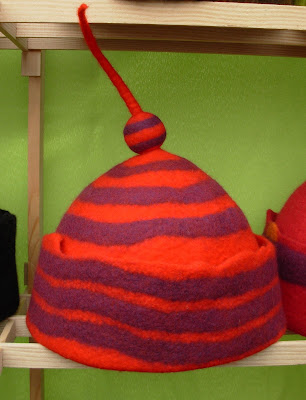
Lauri Chambers creates these fantastic hats! they are works of art each and every one. When surrounded by Lauri's work one has the biggest smile, What could be better than that! Find Lauri here.