8/26/12
TAKE IT OUTDOORS!
I love creating outdoor spaces as you would interior rooms. With all the amazing materials available to use in all-weather conditions. This outdoor space at the Broken Top club in Bend Oregon is the perfect example of taking it outdoors!
This classic teak armchair from the Restoration Hardware / Santa Monica collection is updated with black Perennials all weather fabric, and accent pillows covered in Pendelton blankets. Along with bold punches of color in the powder coated aluminum drum tables.
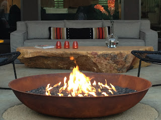
The focal point of the sitting area is this wonderful 54" steel fire bowl fabricated by Modern-Fab of Bend, surrounding the fire bowl are very comfortable "Maia" arm chairs manufactured by Kettal.
For the cooking area we repeated the ledge stone already used in other areas of the home, bringing the materials from the interior outside along with honed black concrete counters fabricated by Cement Elegance of Bend.
The cantilevered bar with classic Bertoia bar stools has a light airy feel blending seamlessly with the landscape enjoying views of the fairways and Cascade peaks in the distance.
I love the contrasts of textures and elements as with the woven willow sphere setting on a curved concrete bench next to the steel fire bowl
In the dining area we used a wonderful teak and steel table from the Sutherland collection mixed with Bertoia side chairs.
Perhaps my favorite thing is this 2,000 pound boulder we found at Empire stone in Bend, after consulting with our installation experts we hired a crane to swing it over the house and into place. A few bold choices mixed in with classic modern pieces has resulted in the perfect mix of elements for this outdoor room.
8/1/12
BLUEPRINT FOR A MASTER BEDROOM
Your master bedroom should be a place of sanctuary, an escape from the hustle & bustle of everyday life. Also a place to live with & enjoy some of your most favorite collections.
In designing any room I am always inspired by the natural surroundings and of course the architecture you have to work with. For this master bedroom the floor to ceiling windows frame spectacular views of the this wooded Northwest landscape, I choose not to compete with the views but enhance with neutral backgrounds and simple furnishings.
The floating maple shelf extends into the bay window behind the bed creating one simple horizontal line, the artwork on the shelf is one of my own created with a sheet of lead in front of it is an antique wood mill wheel. The Japanese screen doubles as sun screen and headboard.
The room flows from the bed area into this bath space with views extending through the entire length of the room. The cabinets in this area were designed to float in the space creating a seamless blend with the architecture rather than reading as built in furniture.
The entrance to the bedroom is framed by this floor to ceiling window looking out to the foothills, on the wall is a trio of simple floating shelves displaying a collection of turned wooden bowls.
The walls throughout the bedroom and bath are covered in a natural madagascar wall covering, here the wall covering extends into a trio of niches perfectly displaying collections. The Chinese elmwood chair and natural cyprus wood stump repeat the theme of ancient and modern combined with natural elements.
Architecture and interiors / J. S. Brown Design
6/24/12
SUNNYLANDS + MUST SEE
Wonderful symmetry created by artichoke Agave
Steel framed reflecting pools along side the cafe terrace
The view looking back over the great lawn to the visitors center
Landscape architect James Burnett has created a striking modern landscape to compliment the visitors center
On a recent trip to Palm Springs I was fortunate to visit the Sunnylands center and gardens. Recently completed to house the visitors center for the Annenberg estate, although the estate tours have been sold out since opening earlier this Spring, for now the visitors center gives a very satisfying glimpse into this architectural treasure. Every Friday the garden docents lead an hour long tour free to the public, in the summer months it starts promptly at 7:30 AM to witch I am grateful for the cool desert morning.
The visitor center is beautifully done with interiors by Michael Smith showcasing collections from the Annenbergs estate and presentations about the estates history. The main house at just over 25,000 square feet was completed in 1966 by the renowned architect A. Quincy Jones and interiors by William Haines and Ted Graber. For more information and tour dates visit www.sunnylands.org
5/22/12
Tea Party (not what your thinking)
This was fun! My latest floral presentation for thirty ladies at lunch. My client has the most amazing collection of tea pots, every one of them a work of art, I almost did not need to add flowers. . . But I did!
(click on photos to enlarge)
Do you have a collection of something wonderful? What a great way to share as table centerpieces, use a variety of the same type of collection in mass for a visual feast!
4/7/12
BLUEPRINT FOR AN OUTDOOR ROOM

People often ask me, where do start to conceptualize a project. I always start with the given architecture as a major influence on the design concept, along with that I create "mood boards"
Objects, elements and materials that lend to choices to be made on any given project.
The biggest mistake most people face is to many choices and unfortunately using all of them.
This is were your mood board or in this case your digital board comes in handy, the biggest lesson to lean is restraint, you may love it all but, use your editing eye. It will help make the most important decision on what direction to take.
This board is for an outdoor space incorporating cooking, dining, lounging and along with it all the needs of privacy and incorporating style from the interior and most of all the relationship to the landscape. This is my first stab at concepts, from here I will edit and add elements as the design progresses. . . I will keep you posted!
4/6/12
ARTIST OF THE MONTH + RON MANN
1/29/12
BEACHFRONT CONDO / Before & After

We recently completed this remodel of a beachfront condo in Southern California, the low-rise mid Century building built on the sand with an Iconic view of the Santa Monica pier.
While the interiors were dated (and not in a good way) the design plan was to keep the clean lines and accentuate the feeling of space and wonderful light the unit has. Because of time and budget considerations we choose to use products almost exclusive from Ikea. While I am a fan of Ikea I have seen my share of bad results from consumers "high on saving a buck", a little design restraint and always a good plan goes a long way . . .
Following are some before and after images, (click on the photo to enlarge)
The kitchen was bad. It was dark and felt small, the full depth refrigerator was barley three feet from the sink cabinet. One word sums this up "Demo"
 We were able to borrow a foot from the closet behind the refrigerator wall, this helps expand the space and the addition of floor to ceiling pantry storage behind white glass sliding doors was huge. This enabled us to eliminate wall cabinets and use 1" white glass tile giving a wonderful reflective surface under the stainless steel shelf.
 Oh my! While I have nothing against mirror, this is just wrong. The combination of the gas fireplace (which did not work) and white shag carpet, did not say welcome to the beach . . .
 We found this cool electric (and very realistic) fireplace framed in honed gray limestone, along with simple framing details to create niches the room has a relaxed sophisticated vibe.
 The bookcase niches are covered with thin stacked porcelain tile and the floating Ikea shelves are back lit with LED lights
 The before photos of the bathroom were to ugly for public viewing, (think White shag carpet and silver mylar wallpaper with sea shells covering walls and ceiling).
These cool "floating" sink cabinets with integral porcelain sink tops really cleaned up the bathroom spaces. We repeated the white glass tile and the mirror doubles as medicine chest on one side.
Subscribe to:
Comments (Atom)


