 A few of my favorite things . . .
Scalamandre damask . . .
Buccellati silver wine bucket . . .
18th century Swedish frame chair from Therion & Co
and a stack of my favorite books!
A few of my favorite things . . . Before makeover
 After makeover (click on photo to enlarge)
 Before
 After
After Recently we were very pleased when our latest project with Black Rock Construction won several awards including best interior detailing and architectural design. We worked closely with the client and Black Rock to create some wonderful architectural details for this Tuscan farmhouse design.
 In the guest room we hung old weathered shutters at the window, in new construction I feel it is important to use some elements with age and patina. The wall sconce selection was a very economical one but works perfectly in the space.
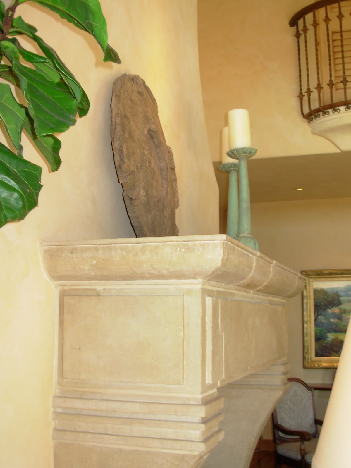 We worked with the firm Stone Cutters to create this massive limestone mantel which is the focal point for this room. They were able to achieve the perfect patina we were looking for, each visit they would embellish the finish until we felt it meet its goal.
 The original design for this room was for the second floor to be completely open with railing running the length of the room. I felt it lacked interest and was not practical for the upstairs space. The solution was to create these wonderful arched balconies which emphasize the iron railing and provide wonderful views over the great room.
 The staircase leading up to the tower was my favorite detail. The first thing you see when entering, we used this wonderful mosaic tile alternating patterns at each step. The iron detail and open plaster work under the stairs was adapted from a beautiful home in Europe, I always look to references from classic architecture for inspiration.
 Decorative light fixtures are so important to the overall design, the wrong choice can really mess up an interior. On this project we had to choose many of the fixtures at a very reasonable price point, and were able to splurge on a few others. There are good looking fixtures at lower price points like the one in the photo of the shutters, while the sconce above has beautiful detail and scale for the stair tower.
 This pair of antique doors we found at a dealer in Los Angeles, they add the perfect focal point in this guest room.
  The entry into the master bedroom we used this deep set arched door which leads you in anticipation of whats to come. The details are what makes a successful design.
 Recently I was asked to participate in a design challenge, Central Oregon's version of HGTV Design Star. While I think most of those reality competition shows are ridiculous, it did sound like fun. The challenge was to create a room setting in 24 hours with different resources and materials assigned to each designer. We were given paint and limited supplies and zero budget,
 The space was a small 10' X 10' box and needed some architectural interest, I chose to create a painted parchment wall treatment. Using white craft paper and spray paint I was able to hang the paper in 24" squares resembling stone blocks.
 Each room had a small window on the back wall, I used a simple matchstick shade and dressed it up with these wonderful side panels made of jute. A simple play on textures and neutral colors helped disguise the small proportions of the room.
 I continued with the theme of neutral texture and contrasting simple elements along with more refined accessories.
  More textural elements included vintage weathered shutters for a room screen and a grouping of raku pottery crystal mineral and bronze table lamp.
 It was actually a lot of fun to work on despite the stress of time limits, but I was not alone working along side two other talented designers from Central Oregon we put on a good show! Would I do it again? What do you think?


 Photos - blackstone Edge Studios
